Nothing kills the vibe of a perfectly good room quite like paint colours that make the space feel like it’s closing in on you.
However, many of us accidentally choose shades that shrink our already small rooms and create that suffocating feeling we can’t quite put our finger on. The wrong paint can transform even a decent-sized space into what feels like a cramped cupboard, while the right colours can make tiny rooms feel surprisingly spacious and airy.
Once you understand which colour choices are secretly sabotaging your space, you’ll never make these claustrophobia-inducing mistakes again.
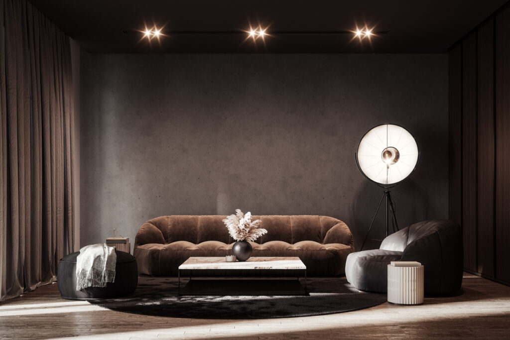
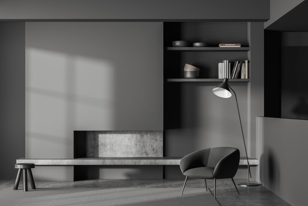
1. Going too dark on all four walls
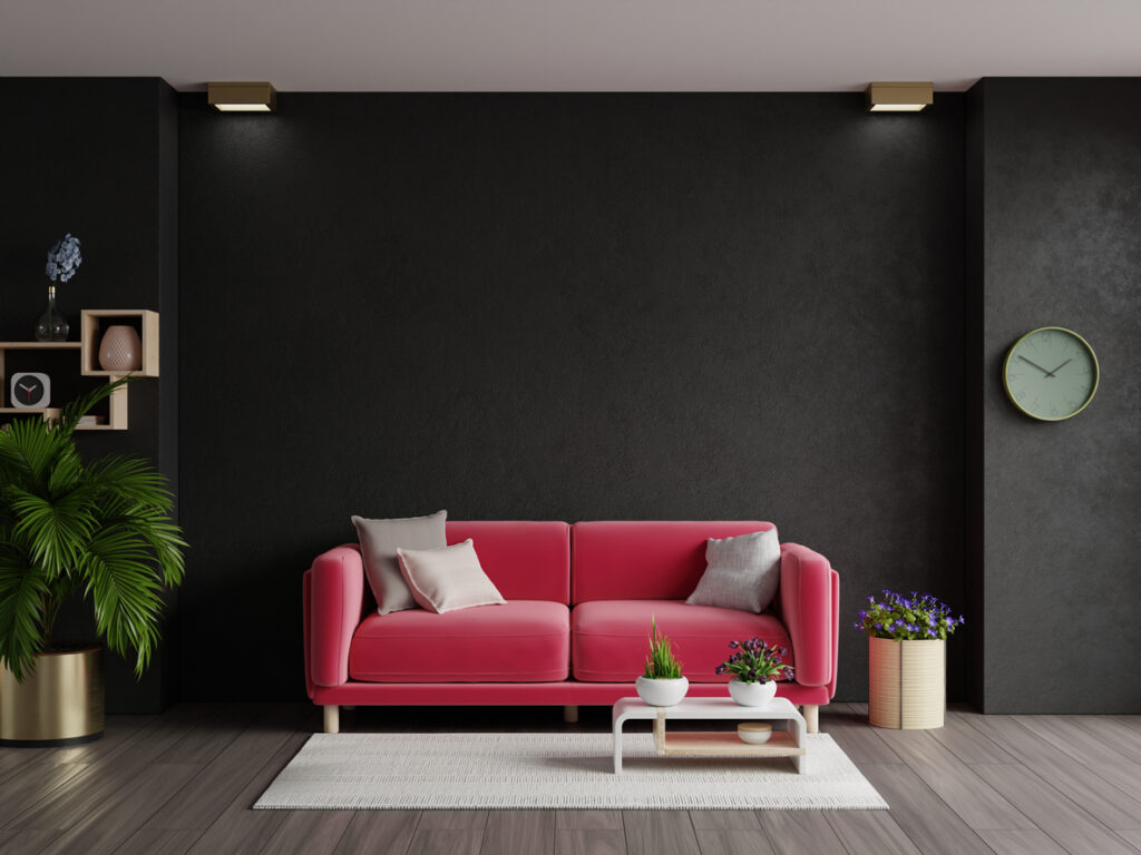
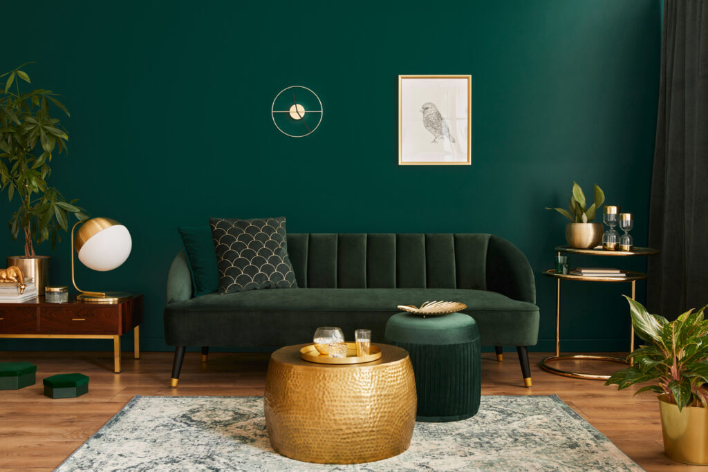
Painting every wall in deep, saturated colours like navy, charcoal, or forest green might look dramatic on Pinterest, but it absorbs light and makes your room feel like a cosy cave rather than an open, breathable space. These colours work brilliantly as accent walls or in specific rooms, but covering all the walls creates visual weight that presses in from every direction.
Light reflects off pale surfaces and bounces around the room, creating the illusion of more space and airiness. If you love dark colours, try using them on just one feature wall and keep the other three walls in lighter shades, or save dramatic dark paint for larger rooms with plenty of natural light that can handle the visual intensity.
2. Choosing colours that are too warm and intense
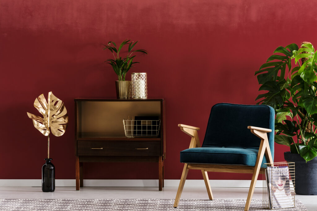
Rich reds, deep oranges, and warm yellows might feel cosy and inviting, but they can quickly become overwhelming and make rooms feel smaller than they actually are. These colours advance visually, meaning they appear to come towards you rather than receding into the background, which shrinks the perceived size of your space.
Cool colours like soft blues, gentle greens, and lavender greys recede visually and create the impression of depth and distance. They trick your eye into thinking walls are further away than they actually are, and they reflect light more effectively than warm colours, keeping rooms feeling fresh and open rather than closed-in and stuffy.
3. Using different colours on every wall
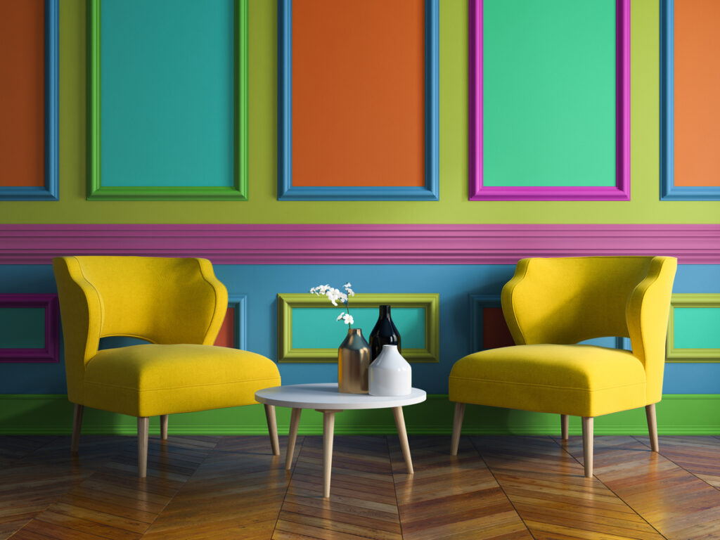
Creating a rainbow effect with multiple colours throughout one room might seem like a fun way to add personality, but it actually chops up the space visually and makes everything feel disjointed and cramped. Your eye doesn’t know where to rest, and the constant colour changes create visual barriers that make rooms feel smaller and more chaotic.
Sticking to one main colour with subtle variations in tone or finish creates flow and continuity that makes spaces feel larger and more cohesive. You can add personality through accessories, artwork, and furniture rather than making your walls compete for attention and accidentally fragmenting your space.
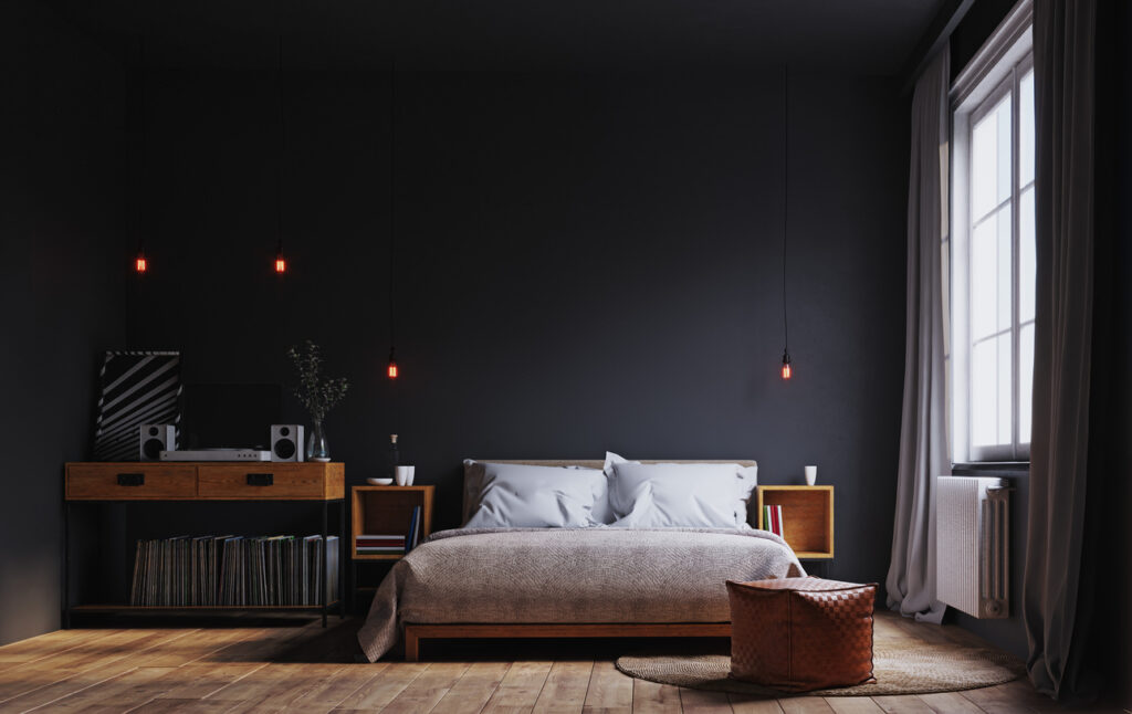
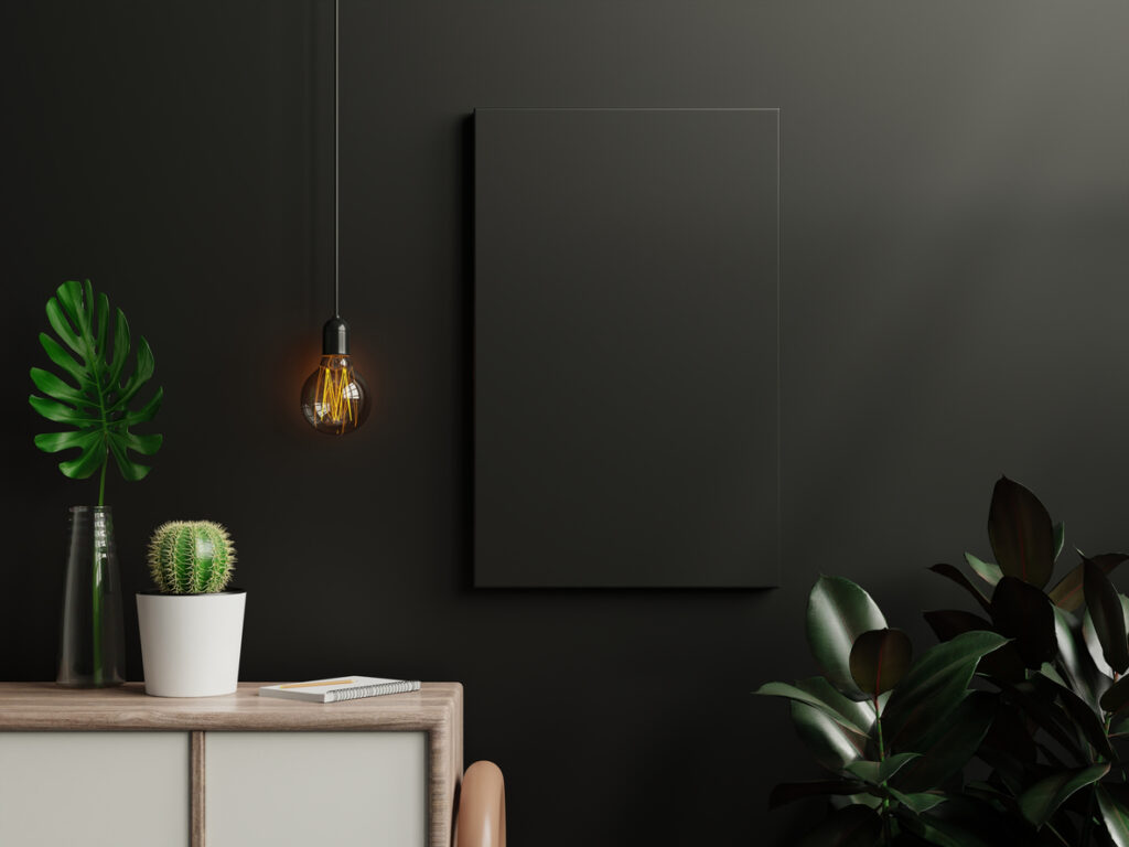
4. Painting the ceiling the same dark colour as the walls
When you carry dark wall colours onto the ceiling, you’re essentially creating a box effect that makes the room feel like it’s pressing down on you from above. Dark ceilings appear lower than they actually are, and combined with dark walls, they create that suffocating feeling that makes you want to escape outside for air.
Keeping ceilings white or in very light shades creates the illusion of height and openness, even when wall colours are deeper. The contrast between walls and ceiling helps define the space and prevents that closed-in feeling, but light ceilings reflect more light back into the room to keep everything feeling bright and airy.
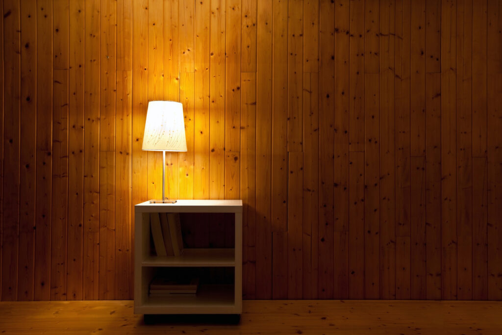
5. Ignoring the room’s natural light when choosing colours
Picking colours based purely on how they look in the paint shop or online completely ignores how they’ll actually behave in your specific space with your particular lighting conditions. North-facing rooms with limited natural light can make even moderately dark colours feel oppressive, while south-facing rooms with abundant light can handle much deeper shades.
Test paint colours in your actual room at different times of day before committing to anything permanent. Colours change dramatically depending on natural light, artificial lighting, and time of day, and what looks perfect at noon might feel claustrophobic by evening when you’re relying on lamps rather than daylight.
6. Using colours with heavy undertones that clash with your lighting
Paint colours have underlying tones that become more obvious under different types of lighting, and when these undertones clash with your room’s lighting, they can create muddy, unpleasant effects that make spaces feel dingy and closed-in. Warm white bulbs can make cool colours look grey and lifeless, but cool LED lights can make warm colours appear garish.
Understanding your room’s lighting helps you choose colours that will look fresh and clear rather than muddy and oppressive. Cool undertones work beautifully with natural daylight and cool artificial lighting, but warm undertones complement warm artificial lighting and golden hour natural light.
7. Choosing colours that are too saturated and intense
Highly saturated colours, even light ones, can feel overwhelming and visually exhausting when they cover large wall areas, creating a sense of visual pressure that makes rooms feel smaller and less comfortable. Bright, pure colours demand attention and can make spaces feel more cramped than they actually are.
Muted versions of your favourite colours often work much better for creating spacious-feeling rooms because they’re easier on the eyes and create a calmer, more restful atmosphere. Soft, desaturated colours still have personality and interest, but they don’t overwhelm the space or compete with your furniture and accessories for visual attention.
8. Not considering the size and function of the room
Using the same colour approach in a tiny bathroom that you’d use in a spacious living room completely ignores how colour affects the perception of space differently depending on room size and purpose. Small rooms need colours that open them up and make them feel larger, while larger rooms can handle more dramatic colour choices.
Bathrooms, hallways, and other small spaces benefit enormously from light, reflective colours that bounce light around and create airiness. Bedrooms might handle slightly deeper colours for cosiness, but even then, lighter shades on the ceiling and plenty of light-reflecting surfaces help prevent that closed-in feeling.
9. Forgetting about colour temperature and mood
Colours have psychological effects that can make rooms feel either expansive and calming or tense and constraining, and ignoring these effects when choosing paint can accidentally create spaces that feel claustrophobic regardless of their actual size. Some colours naturally create feelings of openness, while others make us feel enclosed.
Cool colours tend to feel more spacious and calming; very warm or intense colours can feel energising but also potentially overwhelming in enclosed spaces. Consider how you want to feel in each room and choose colours that support that mood while also creating the visual spaciousness you’re after.
10. Not testing colours in different lighting conditions
Paint colours look completely different under various lighting conditions throughout the day, and failing to test how your chosen colour behaves from morning natural light through to evening artificial lighting can result in colours that feel heavy and oppressive when you’re actually using the room. What looks perfect in the paint shop might feel claustrophobic in your home’s specific lighting.
Paint large test patches on different walls and observe them at various times of day and under different lighting conditions before making your final decision. The testing process helps you choose colours that will feel consistently spacious and pleasant, rather than colours that only work under specific lighting conditions.